Journal / Brand & Identity
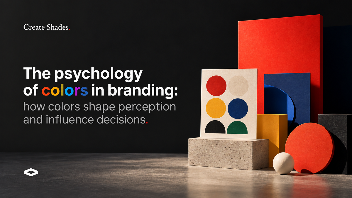
the psychology of colors in branding: how colors shape perception and influence decisions.
Before Customers Read Your Message, They See Your Colors
Imagine walking into a supermarket.
You see hundreds of products competing for your attention.
Some instantly feel premium.
Some feel playful.
Some feel healthy.
Some feel luxurious.
What's interesting is that these impressions often happen before you've read a single word.
Color is one of the most powerful tools in branding because it influences how people feel before they consciously process information.
As designers, we don't simply choose colors because they look beautiful.
We choose them because they communicate something.
The right color palette can help a brand feel trustworthy, energetic, premium, natural, innovative, or approachable.
In this article, we'll explore how color psychology works, why it matters in branding, and how businesses can choose colors strategically rather than emotionally.
Why Colors Trigger Emotions
Human beings naturally associate colors with experiences.
Over time, these associations become emotional triggers.
When we see certain colors, our brains immediately connect them with specific feelings or expectations.
Red
Commonly associated with:
- Energy
- Excitement
- Passion
- Urgency
Brands often use red when they want to attract attention quickly.
Blue
Associated with:
- Trust
- Reliability
- Professionalism
- Stability
This is why many banks, technology companies, and corporate brands use blue.
Green
Associated with:
- Nature
- Growth
- Wellness
- Sustainability
Frequently used by wellness, skincare, and organic food brands.
Yellow
Associated with:
- Optimism
- Happiness
- Creativity
- Energy
Often used by beverage and lifestyle brands.
Black
Associated with:
- Luxury
- Sophistication
- Exclusivity
- Power
Common in premium fashion, fragrance, and luxury brands.
Practical Takeaway
Colors don't have universal meanings, but they influence perception. Choose colors based on the emotions you want customers to experience.
Industry Examples: Why Certain Colors Dominate Certain Markets
Color choices are rarely random.
Industries often develop visual patterns because customers already associate specific colors with certain expectations.
Food & Beverage Brands
Food brands often use:
Red
Red stimulates appetite and grabs attention.
Examples:
- Coca-Cola
- KFC
- McDonald's
Yellow
Associated with happiness and energy.
Examples:
- Lay's
- Fanta
- Chupa Chups
Green
Used for healthy, natural, or organic products.
Examples:
- Whole Foods
- Organic food brands
- Plant-based products
Lesson
Food brands use colors to influence appetite, freshness, and taste perception.
Skincare & Beauty Brands
Skincare brands often use:
White
Cleanliness and purity.
Sage Green
Natural ingredients and wellness.
Beige & Nude Tones
Softness and sophistication.
Deep Black
Luxury and premium positioning.
Examples:
- Aesop
- The Ordinary
- Rhode
- Minimalist
Lesson
Beauty brands often focus on trust, simplicity, and product quality.
Luxury Brands
Luxury brands tend to use:
- Black
- White
- Gold
- Deep Green
- Burgundy
- Navy
Examples:
- Chanel
- Rolex
- Dior
- Tom Ford
Lesson
Luxury branding often relies on restraint rather than excessive color.
Why Color Combinations Matter More Than Individual Colors
One color alone rarely creates a brand.
It's the combination that creates personality.
For example:
Black + Gold
Luxury and exclusivity.
Sage Green + Cream
Natural and calming.
Navy + White
Professional and trustworthy.
Beige + Brown
Warm and timeless.
Purple + Pink
Creative and expressive.
Example
Imagine a wellness brand.
Bright red might feel aggressive.
Soft sage green and cream would feel more calming and aligned with customer expectations.
Practical Takeaway
Think in palettes rather than individual colors.
Strong brands create color systems, not single color choices.
Cultural Differences in Color Perception
Color meanings are not identical everywhere.
A color that communicates one message in one culture may communicate something completely different elsewhere.
White
Western cultures:
- Purity
- Simplicity
- Cleanliness
Some Asian cultures:
- Mourning
- Remembrance
Red
Western cultures:
- Passion
- Excitement
Many Asian cultures:
- Good fortune
- Celebration
- Prosperity
Green
Often associated with:
- Nature
- Growth
- Sustainability
But cultural and regional interpretations can vary.
Practical Takeaway
If your brand serves an international audience, research cultural color meanings before finalizing your identity system.
How to Choose the Right Brand Colors
One of the biggest mistakes businesses make is choosing colors based entirely on personal preference.
Instead, ask:
What emotions should customers feel?
Should they feel:
- Safe?
- Excited?
- Luxurious?
- Inspired?
- Calm?
Who is the audience?
Different audiences respond to different visual cues.
What category are you in?
You don't want to look identical to competitors.
But you also don't want to confuse customers.
What is your brand personality?
Premium?Playful?Modern?Traditional?Creative?
Your colors should reinforce that personality.
A Simple Formula I Use
When building brand palettes, I often use:
1 Primary Color
The dominant brand color.
1 Secondary Color
Supporting personality and flexibility.
2–3 Neutral Colors
For balance, readability, and consistency.
This approach creates systems that are easier to scale across websites, packaging, social media, and marketing materials.
Final Thoughts
Color is far more than decoration.
It's communication.
Long before customers understand your product, they begin forming opinions based on visual cues.
The most successful brands don't choose colors randomly.
They choose colors strategically.
Because the right colors can:
- Build trust
- Increase recognition
- Communicate personality
- Strengthen positioning
- Influence buying decisions
And when combined with thoughtful branding, color becomes one of the most powerful tools available to any business.
Looking for a Color Palette That Truly Reflects Your Brand?
Whether you're launching a new business, redesigning packaging, or building a complete visual identity, strategic color choices can transform how customers perceive your brand.
Explore my branding and packaging services to create a visual identity that's both beautiful and meaningful.
need help designing something that sells.
Brands, packaging, campaigns and illustration: let's talk about your project.