
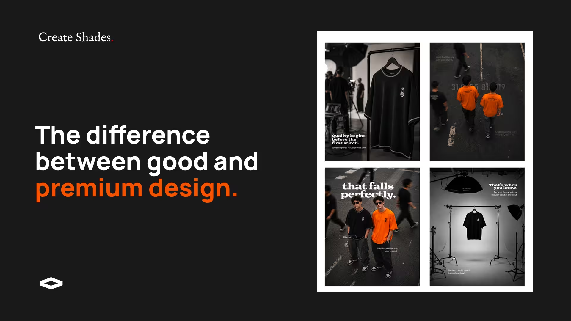
Premium isn't about spending more. It's about creating the right perception.
People form opinions about a brand long before they experience its product or service. A website, logo, packaging, social media presence, or even the typography on a business card can influence whether a brand feels trustworthy, professional, and worth paying for.
The brands that feel premium aren’t always the most expensive. They’re often the most intentional.
Here’s what makes the difference.
Make a strong first impression
Customers decide how they feel about a brand within seconds. Every visual touchpoint contributes to that first impression—from your website and packaging to your Instagram feed and marketing materials.
A premium brand feels clear, polished, and consistent from the very first interaction.
Consistency builds trust
One of the quickest ways to weaken a brand is inconsistency.
Using different colours, fonts, photography styles, or messaging across platforms creates confusion. Consistency, on the other hand, builds familiarity, and familiarity builds trust.
Whether someone visits your website, sees your packaging, or comes across your social media, the experience should feel unmistakably connected.
Let your design breathe
Premium brands rarely try to say everything at once.
Generous spacing, clean typography, and a clear visual hierarchy make content easier to understand while creating a sense of confidence and sophistication.
Sometimes the most effective design decision isn’t adding something new—it’s removing what’s unnecessary.
Use colour with intention
There isn’t a single colour that feels luxurious. What matters is how colours work together.
A refined colour palette creates harmony and strengthens recognition. Limiting your palette to a few carefully chosen colours often feels more premium than using many competing shades.
Simple, consistent colour systems tend to stand the test of time.
Pay attention to the details
The smallest details often shape the biggest impressions.
Typography, photography, button spacing, packaging finishes, and the way content is presented all contribute to how a brand is perceived.
Individually these details may seem minor. Together, they create an experience that feels thoughtful and complete.
Learn from brands that do it well
Brands like Apple, Aesop, and Rolex aren’t recognised simply because of their products. Their visual identity remains consistent across every customer touchpoint.
Rather than following every design trend, they focus on clarity, restraint, and long-term recognition.
That’s what gives them a premium presence.
Common mistakes that make brands look less premium
- Using too many fonts and colours
- Following trends without purpose
- Inconsistent branding across platforms
- Low-quality imagery
- Overcrowded layouts and messaging
A premium brand isn’t created by adding more. It’s created by refining what matters most.
Final Thoughts
Looking premium isn’t about expensive materials or a bigger marketing budget. It’s about creating a consistent, thoughtful experience that inspires confidence at every interaction.
When branding is intentional, customers naturally perceive greater value, trust the business more, and remember it for the right reasons.
if my work resonates with you,
I would love to hear your story.
If you’ve made it this far, chances are you’ve got an idea waiting to take shape. I’d love to hear about it.